Breathe
Brief
“Breathe” is an award-winning interactive data story (2nd Place Winner, Data Lab, University of Edinburgh) that explores what we can gain by working towards climate action. In particular, it examines air quality as a co-benefit of net-zero actions across the UK. The data are modelled estimates of potential gains over the next 25 years if we improve climate outcomes. The project also shows the correlation between the rise in parcel deliveries and climate change, encouraging online shoppers to adopt behaviours that benefit not only the planet and environment but also the air we breathe.
Source
Edinburgh Climate Change Institute,
University of Edinburgh.
//doi.org/10.7488/ds/7978
Deliverables
- Interactive Data Story using HTML and JS
- Bespoke Interactive Maps and Chart
- Visual System Design
The challenge was to take complex datasets from the Edinburgh Climate Change Institute (ECCI) and transform them into a visual story that is both engaging and understandable. This involved designing a carousel to introduce insights, creating an interactive map of air-quality gains, and building a waterfall chart to show how benefits accumulate over time. Every element was guided by careful research and storyboarding to ensure clarity and an intuitive user experience.
These were the comments from the Data Lab and the judges:
This project highlights the uplifting truth that climate action can meaningfully improve our quality of life within a single generation. Through maps and visual storytelling, the visualisation shows how cleaner air builds steadily over time, why sustained effort delivers the greatest rewards, and how everyday choices like opting for greener delivery habits can inspire broader change. Ultimately, this visualisation empowers individuals and communities to shape a healthier, more thoughtful, and more hopeful future together.
Judges comments:
The judges really loved the project’s strong, engaging storytelling and its clean, beautifully polished design. They especially appreciated how clearly the air‑quality co‑benefits were communicated, with thoughtful timelines, per‑person insights and interactive touches that encouraged exploration. The overall layout, colour palette, and visualisations were described as professional, readable, and genuinely delightful to experience.
Designing the data
The climate change challenge
After careful consideration, I decided not to rely on charts to introduce the problem. While effective, they would have inundated the reader before reaching the core insights. At the same time, simply listing the issues would lack clarity and engagement.
Instead, I focused on the nature of the behaviour itself. Online shopping and returns form a cycle, with each stage contributing to emissions. This led to the development of a carousel that walks through the process step by step.
Unlike typical carousels, where information is revealed in isolation, it was important to show the full system at a glance. Even as individual stages are introduced, the broader context remains visible. To achieve this, I used scale and opacity to guide attention, rather than hiding elements entirely.
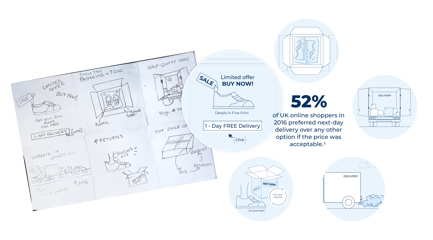
The carousel acts as an entry point to the story, setting context before the data is explored in more detail. To develop the sequence, I first mapped the flow through a series of sketches, ensuring each stage communicated a clear idea. The final illustrations and interactions were then designed and prototyped in Figma.
Mapping co-benefits:
After explaining the challenge and the modelled data, I created an interactive map. It shows the modelled air-quality gains at the neighbourhood level across the UK, provided by the ECCI. Users can explore potential gains in 2025 versus cumulative gains by 2050. The data indicate that average gains could rise from £3,700 to over £1 million.
The map conveys this through a bespoke colour-coded legend, highlighting extreme gains such as those in Oxford. The layered map, combined with a slider, allows users to compare gains over time and zoom in on areas with major gains. The purpose of this map was to immerse the user in the experience, particularly allowing them to explore places they recognise, like where they work and live, giving an idea of the impact that can be achieved locally as well as globally.
The Waterfall
A waterfall chart visualises how individual co-benefits—such as cleaner air, reduced respiratory illness, or safer streets—add up to create the total socio-economic impact. I designed this chart to show the cumulative effect clearly, enabling users to instantly see which benefits drive the largest change and how all the pieces combine over time.
The decision to use a waterfall chart was deliberate, chosen over more conventional options such as a line or bar chart. A line chart, while effective for showing trends over time, would still emphasise the slow pace of early gains and risk reinforcing a sense of apathy. A bar chart, on the other hand, allows for year-by-year comparison but fails to communicate the cumulative impact of those changes.
The waterfall chart was best suited to highlight the key insight from the modelled data: the majority of gains (62%) occur in the last 10 years. This suggests that the impact of actions taken today compounds over time.
The Typography, colours and Illustrations
The visual identity was designed to reflect the central theme of clean air. A palette of light blue and white was chosen to evoke a sense of clarity and openness.
Typography reinforces this direction. Sansita Swashed is used as the display typeface, paired with Montserrat for headings and body text. While the overall typographic tone is light and approachable, size and weight is used deliberately to establish hierarchy, with bolder styles guiding the reader through the content.
Subtle cloud-like motifs in light blue are introduced at the beginning and end of the project. These elements frame the narrative, providing visual continuity without distracting from the data.


This project was awarded second prize at The Data Lab Competition 2026, recognised for its design-led approach and for highlighting how meaningful change can be achieved within our lifetimes. It was a rewarding experience to contribute to an initiative that brought together data science, design and education, while exploring how data storytelling can make complex issues more accessible and engaging.