academy.africa MOOC platform
Brief
Update the MOOC site as part of other site updates (CFA, openAfrica etc) using Figma as opposed to invision etc. Code for Africa is a non-profit and therefore relies heavily on their partners and benefactors. While usability is the major concern for these site updates, an underlying concern is staying updated and having a more professional appearance.
Client
Code for Africa (CfA)
Deliverables
- UI Design
- Brand and Visual Identity
Brand
The logo
One cohesive logo was needed under which all future sessions, products and sites would fall but wasn’t too far from the original. The previous logo had multiple colours and inconsistent typography. I turned it into a single coloured logo so that it can be used on different backgrounds and match the new design and motifs. I also changed the font to IBM Plex consistent with CfA's new logo and identity. The colour palette is also a derivative of CfA's visual system.

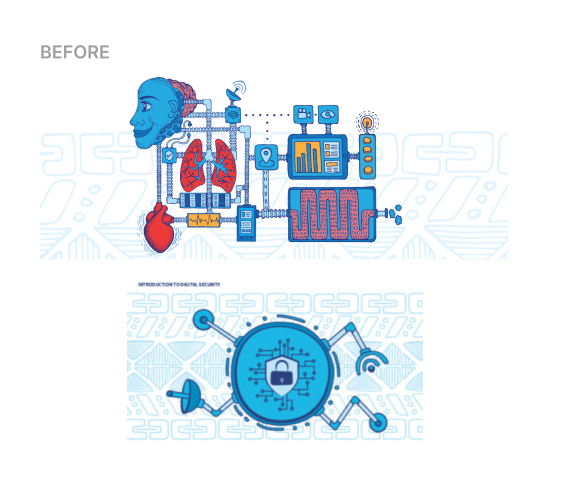
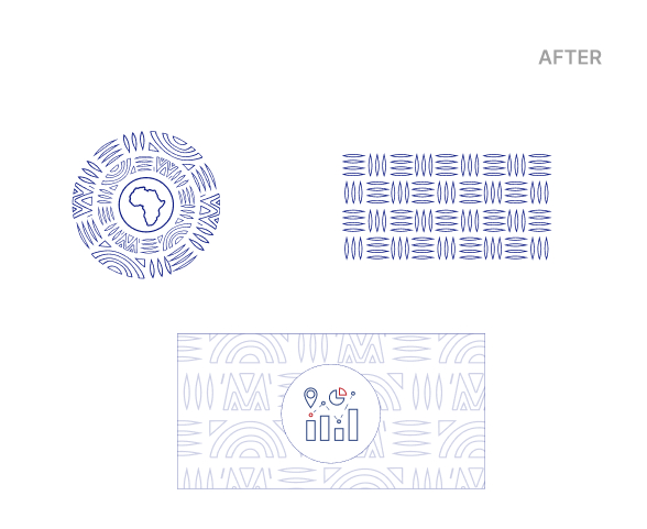
The Motif
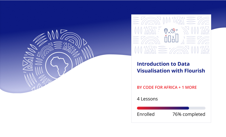
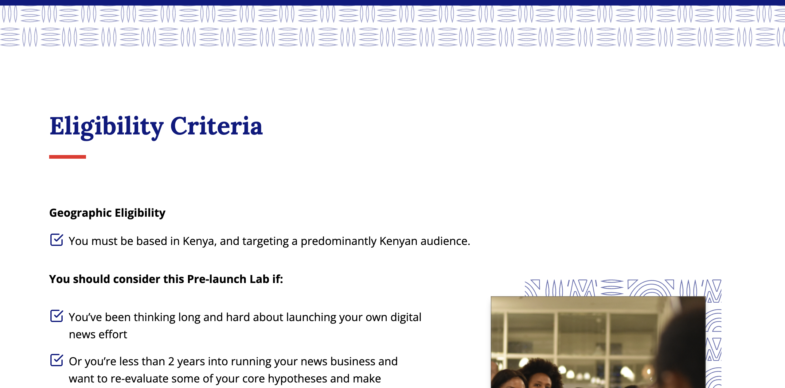
The previous motif relied on cartoon-like illustrations that felt outdated, reflecting a style from a decade ago. To modernize it, I drew inspiration from African textiles to create a versatile pattern used across backgrounds and visual elements. The circular form of this pattern, set against the blue hero background, symbolizes the dawn of a new era—especially for students who will use the MOOC to advance their careers.
UI Design
The Design System
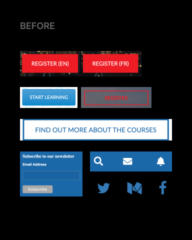
To establish a cohesive visual system for the new UI, I conducted a thorough audit of the previous site and identified inconsistencies across buttons, icons, and color usage.
To improve the design system, I created a unified set of components—including buttons, progress bars, and icons—ensuring consistent styling, spacing, and interaction patterns throughout the interface. This approach not only enhances visual harmony but also improves usability and scalability across the platform.
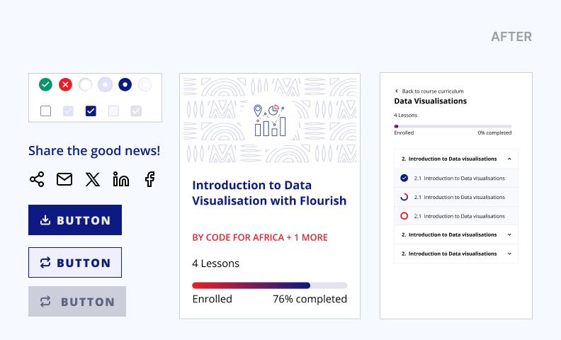
Other Applications
The new scalable design system for the MOOC made it easy to extend the visual language to other sites and promotions by academy.AFRICA. Reusable components, modular layouts, and consistent colors and typography ensured a cohesive look and feel, reinforcing the academy’s identity across platforms.
Working on this dynamic and responsive site was a fantastic experience. I hope it provides a more positive experience for the users of academy.africa